
 Introduction
 Mapping by Street Address
 'Thematic' Mapping
 Where to Find It
Mapping is a great way to put information in context.
The right map, with the right data to back it up, can show you:
-- where a particular type of crime has occurred most often
-- which neighborhood sends its kids farthest to school
-- the spread of a disease
-- a city's growing boundaries over time
-- the area affected by a spill of toxic waste
-- the distribution of people by race, income, education, political party or any other demographic fact at your disposal.
To make a good map, you need a location -- an address -- tied to your data,
and a map that can match your address.
The mapping process, and the resulting image, differ depending on whether
your locations are keyed to a street address (123 Main Street) or a geographic
region such as voting precinct, police beat, census block group, city or
county boundaries.
Mapping by street address or X,Y coordinates will give you a picture of
points scattered across the landscape.
Mapping by region creates 'thematic' maps with varying shades or colors to
indicate different values in each region.
|
The 'Street' column contains the complete street name. The columns 'FromLeft' and 'ToLeft' contain the address range for even numbered addresses on Brooks and odd numbered addresses on Peace. The columns 'FromRight' and 'ToRight' contain the address range for odd numbered addresses on Brooks and even numbered addresses on Peace. |
To find the address 120 Brooks Avenue on this map, MapInfo would first search for Brooks Av, then find the segment with the even numbered range between 100 and
198, and then place a symbol on the map screen about 1/5 of the way between
. Next, it calculates that 120 is about 1/5 of the way between 100 and 198,
and it places a symbol on the map at about that point.
This process, called 'geocoding', relies on having two clean data sets:
the data you bring in, and the data in the map itself.
Here's an example of a table of crimes in Raleigh that can be matched to a street map of the city. Note that all the elements of the address are in one column (1234 W Peace St).
| Offense | Date | Address | Beat | Time |
|---|---|---|---|---|
| Auto Theft | 09/10/96 | 215 S McDowell St | RPD*127 | 14:23 |
| Rape | 09/10/96 | 123 Gardner St | RPD*135 | 20:37 |
| Larceny | 09/10/96 | 320 Dixie Trail | RPD*157 | 15:15 |
| Auto Theft | 09/16/96 | 400 Glenwood Av | RPD*157 | 02:10 |
| Rape | 09/17/96 | 550 E Bragg St | RPD*142 | 11:57 |
| Drugs - Possession | 09/19/96 | 320 Dixie Trail | RPD*157 | 15:03 |
From a table like this, you could map crime by the type of crime, the time or date when it occurred, the police beat, or even selected neighborhoods that you identify by street address.
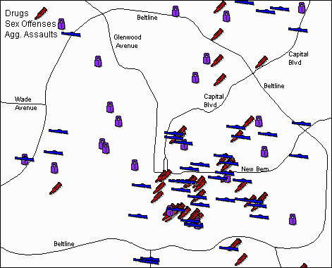
Here's an example of a crime map:

This map shows three types of crime -- drugs, sex offenses and aggravated
assault -- committed in Raleigh during a given time period.
The crimes were
geocoded separately, using different symbols to indicate each crime.
Then
the three maps were layered together, along with a map of major highways,
to get this image.
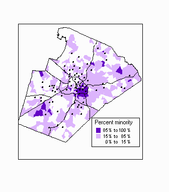
Here's an example of a thematic map:

The colored areas -- blue, lavender and white -- represent hundreds of tiny
'nodes' or neighborhoods, defined by the school system for assigning students
to schools.
We used a table that contained the percent of minority students
in each neighborhood, matched it to the map of 'nodes', and colored each
node according to the racial proportions.
Then we overlaid the locations
of Wake's 67 elementary schools (seen here as black dots).
The map was created to give an indication of the schools' racial balance if the system reverted to neighborhood schools.
If you have other questions about mapping, please ask Donna Seese or past CAR Fellows (particularly Craig Jarvis) for help.
This page was created by Donna Seese
Last updated May 7, 1997