Keys to Understanding the Petroleum Situation
by Jon Bosak
Last updated 16 October 2010To fully grasp the predicament we’re in, it’s necessary to briefly introduce four key understandings: how oil extraction behaves; the problem with flow rates; the concept of EROEI; and the surprising facts about coal.
Key Understanding #1: How Extraction Behaves
The most basic facts about oil production are these: averaged over any given oil-producing region, the output of multiple oil wells rises to a peak of production and then enters a period of irreversible decline; and the peak of production generally comes at roughly the halfway point in the eventual total output of the region. We saw this pattern in Alaska...
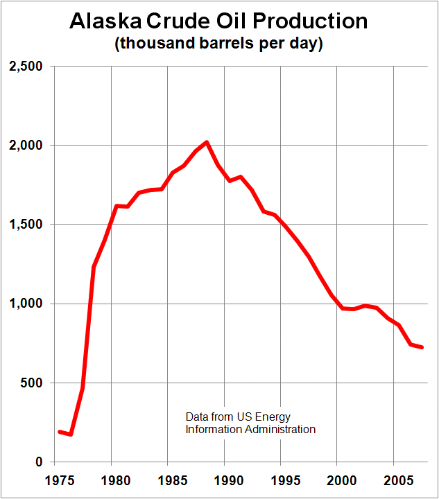
Wikimedia Commons
And in the North sea...
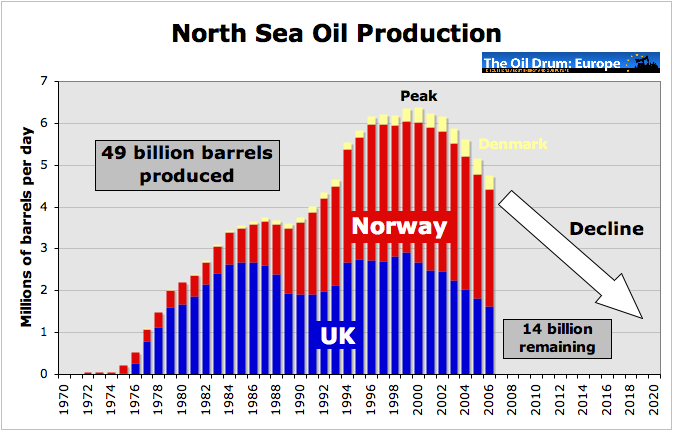
The Oil Drum: Europe
And in Mexico (our third-largest source of imported oil)...
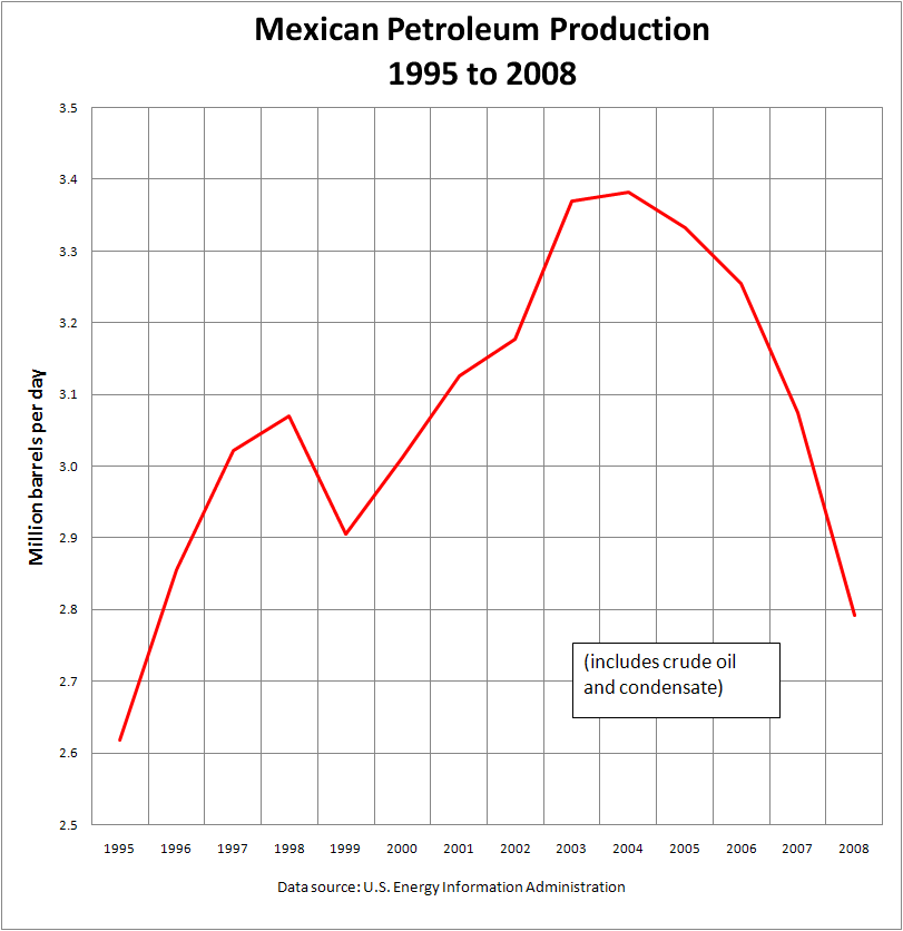
Wikimedia Commons
Even Russia, a major exporter of oil, is not immune from the inexorable mathematics of oil extraction. The fact that it’s producing more now than it ever has is no comfort once you understand the general pattern.
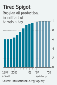
Wall Street Journal
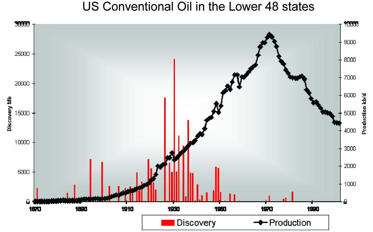
The paradigmatic example of oil extraction over a large area is production in the U.S. lower 48 (i.e., excluding Alaska).
ASPO
This graph demonstrates a number of key facts about oil.
First, of course, it shows once again the pattern seen in the previous examples: the rate of production rises rapidly to a peak, and once that peak is reached, the rate of production falls just as rapidly. (This is the black line in the graph. We’ll come back to the red bars over on the left in a moment.) What makes this example especially instructive is the breadth of the area covered, the range of geologic types in that area (which makes the lower 48 a good proxy for the world in general), and most importantly, the complete absence of political factors that might obscure the natural history of production over a large area. This is a picture of pure, flat-out, unrestrained capitalist resource exploitation uncomplicated by artificial limits or ecological considerations. It’s what “drill baby, drill” looks like if allowed to go to its logical conclusion.
Another key point illustrated here is the almost complete disconnect between production decline and demand. The period following the peak in lower-48 production (which occurred around 1970) has seen some major price shocks and supply disruptions, particularly in the period following the Arab oil embargo in 1973. None of this had the slightest effect on the decline in production. Despite overwhelming economic incentives to increase drilling, no amount of further exploration and development could reverse the slide downhill once past the peak.
Thus it can be seen that the naive and widespread belief that a rise in prices will inevitably result in greater production is simply not true. Ordinary economic forces don’t apply if the underlying constraints are physical. No amount of money will buy you an immortality pill, or give you little wings to fly, or put more oil into the ground. Here’s another look at the Alaskan case that demonstrates the point:
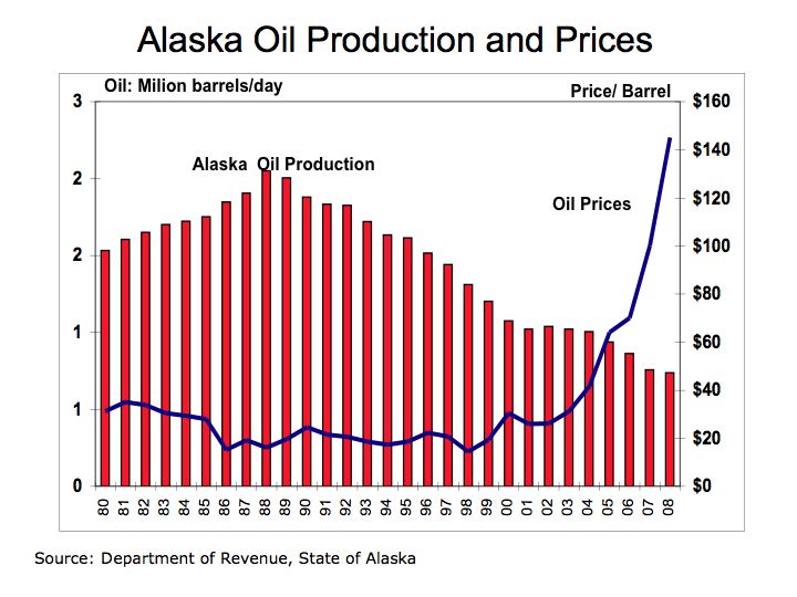
As you can see, the rise in prices beginning in 1998 had just a transient and almost invisible effect on oil production in the decade following. The same price curve could be overlaid on any of the production graphs shown here. High prices have virtually no effect on production from a given area once the decline sets in. The belief of many economists that high prices will magically cause an increase in production is equivalent to thinking that when prices reach a certain point, oil will start condensing out of thin air and all we need to do is stand around catching it in buckets. But physical reality doesn’t work that way.
The U.S. lower-48 case we were looking at a minute ago has one further lesson to convey before we move on. Let’s take a look at that graph again.

ASPO
The red bars over toward the left show the eventual amount of recoverable oil represented by each major discovery. You can’t extract what you haven’t discovered, so the total of these discoveries represents the outer limit of what can eventually be extracted. Discoveries follow a curve not unlike the one for extraction, with the peak of discovery coming about 40 years before the peak of production. This lag is typical of the general case, although the two peaks come closer together now that we have developed techniques for getting the oil out of the ground faster.
Most importantly, the U.S. lower-48 experience shows that, just as better extraction techniques had virtually no effect on the rate of decline past the peak of production, better discovery techniques could not change the shape of the discovery curve, even though our ability to find oil has improved by orders of magnitude over the last half century. So the belief that technological improvements or economic forces will solve the discovery problem is just as mistaken as the belief that technological improvements or economic forces will solve the production problem.
With these basic patterns established, we’re ready to take a look at discovery and production for the world as a whole.
ASPO
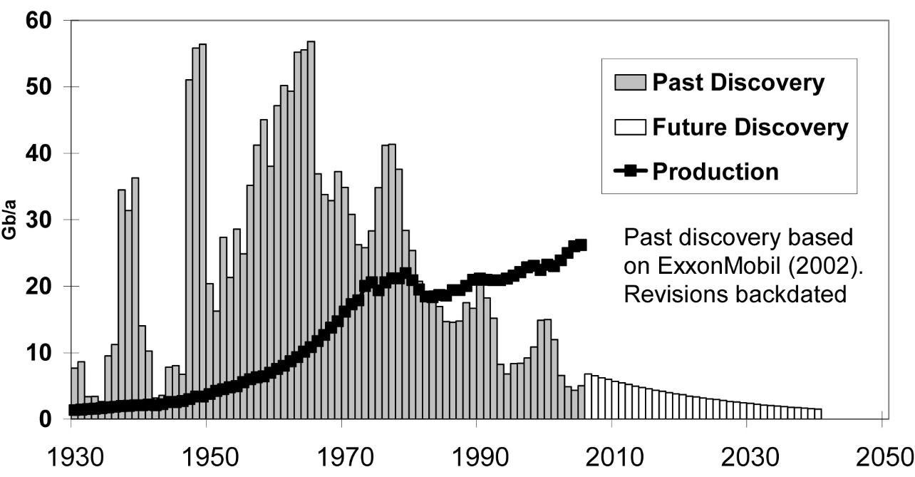
Again we see discovery and production in the same graph, this time plotted against the same axis, which means we can compare the area under the discovery curve with the area under the production curve.
The production line looks very much like the others right up to the Arab oil boycott of 1973, at which point it abruptly levels off and even falls for a few years. This is a clear case of political considerations overriding the usual extraction curve, and it’s evident from the earlier examples that if unrestrained, the production curve would have peaked somewhere in the vicinity of 2000 (about 40 years after the peak of discovery); compare the area under the discovery curve (representing the total possible to extract) with what would have been the halfway point in the area under the production curve if pure unrestrained exploitation had been allowed to continue. Even with the delay, it’s clear that we’re not far from that halfway inflection point now.
A rate of production increasingly in excess of the rate of discovery, as shown here, makes an eventual reckoning inevitable. The last year we discovered more oil than we used was 1981; today we’re using three barrels of oil for every barrel we discover.
Quality vs. Quantity
It’s important to remember that oil production is taking place against a background of declining effective energy content that has been going on for some time. This is an effect of our transition to the backside of the production curve; the first half is when you use up the good stuff.
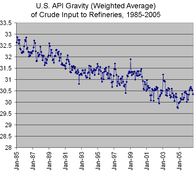
If you follow oil prices, you’re familiar with the phrase “light, sweet crude.” “Light” means that the oil contains a high proportion of the lighter fractions that give us gasoline, diesel fuel, kerosene, and jet fuel, and less of the heavier fractions that give us stuff like bitumen and asphalt. “Sweet” means that the oil contains a lower proportion of sulphur. The lighter and sweeter the oil is, the more useful liquid fuel it contains and the easier and cheaper it is to refine. Over the last quarter century, the average quality of conventional crude oil has steadily declined in both these categories.
Here are two graphs from 2005 showing the long-term trends. First, API Gravity, which is an inverse measure of how heavy the oil is (i.e., the bigger the number, the lighter the oil).
joewp
Light crude oil is defined as having an API gravity higher than 31.1°, medium oil as having an API gravity between 31.1° and 22.3°, and heavy oil as having an API gravity below 22.3°. So in the 20 years from 1985-2005, average crude fell an entire grade on this measure of quality.
The sulphur picture is no better:
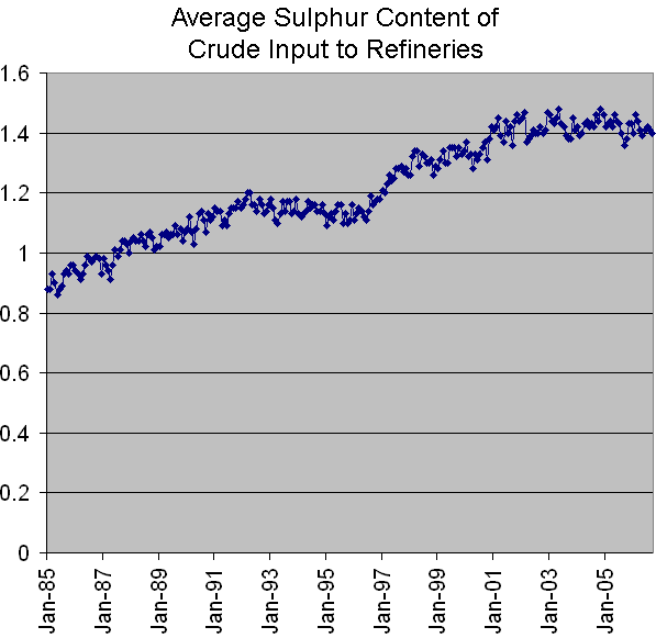
joewp
Higher sulphur content requires more expensive refining processes and newer equipment.
The Move Offshore
Global oil production from onshore sources peaked years ago, and the growth of total oil production since then has come from offshore drilling. But now the easy pickings there are mostly gone, too, and the big finds are increasingly far out into deep water. This makes the extraction increasingly expensive and problematic.
The effect of the recent BP Gulf disaster will be to add further expense to this process by increasing the cost of insurance and the overhead of better safety measures. Due to the transfer of scarce equipment to other venues, the knock-on effect of the recent U.S. decision to suspend production in the Gulf will be a reduction in future domestic rates of production, and this will tend to exacerbate the effect on the U.S. of the inevitable crunch when it comes.
Key Understanding #2: The Problem Is Rates of Flow
A very common misconception heard in reactions to discussions of this kind is the idea that we’re talking about absolute amounts, either absolute amounts eventually produced or absolute amounts in the ground. Often the discussion is mischaracterized as one about “running out of oil,” typically with a reference to the huge amount of oil still left.
There is indeed an awful lot left—about half of what we’ll ever be able to get, in fact. But in the second half of the story it becomes increasingly harder to find and extract the oil, and the stuff we do get is of decreasing quality. The result is a reduction in the effective rate of production as measured (for example) in millions of barrels per day.
Here’s a little thought experiment to demonstrate the point. Suppose you’re in a group of 10 people who find themselves stranded on a desert island with plenty of supplies but no water. You know that a person needs a gallon of water a day to survive (let’s say). Fortunately for you, the island was surveyed by a scientific team that has left the information that the island is sitting above a rock formation below which is a reservoir containing millions of gallons of fresh water. Even better, they left a little solar-powered well that provides the only access to this fresh water.
Unfortunately, the well can only produce 5 gallons a day. Does it comfort the 10 of you to know that there are millions of gallons of fresh water waiting to be extracted? No, because your problem is not the absolute amount available but rather the rate at which it can be supplied—not gallons, but gallons per day. If the rate you can produce water can’t keep up with the rate at which you need to consume it, you’re in trouble.
The reason this is important, and the crux of the economic problem, is that price is determined by the relationship between the rate of demand and the rate of supply. The rate of demand is being driven inexorably upward by third-world development and world population growth. Since World War 2, there has never been a gap of long duration between the rate of demand for oil and the rate of production, and the productive capacity to keep up with demand has kept the price of liquid fuels artificially low. The worrisome aspect of a global producton peak is the resource competition that opens up when the rate of production fails to meet the rate of demand.
So let’s be clear: this is not about running out of oil. A hundred years from now, there will still be plenty of oil left. If you want to buy a gallon of gasoline, someone will be happy to sell it to you. The problem is how much you’ll have to pay for it.
Key Understanding #3: Energy Return On Energy Invested
A third key understanding, this one not just about oil production but about energy production in general, comes from setting aside the economic considerations and looking at energy accounting from a purely physical standpoint.
Every process of energy production uses a certain amount of energy to do its work. The amount of energy you get out of the process compared to the amount you have to put into it is called Energy Return On Energy Invested, or EROEI. EROEI is the number you get when you divide energy output by energy input. For any process to be worth pursuing, EROEI has to be substantially greater than 1; that is, the process has to produce substantially more energy than it uses—otherwise, it’s not a net source of energy.
The EROEI of petroleum used to be fabulously good, which is one of the reasons we fell in love with it. In the 1930s, the EROEI of oil production was better than 100; in other words, it took an energy investment equivalent to the energy in one barrel of oil to produce a hundred barrels or more. No problem with the economics of that deal!
But the growing difficulties of finding and extracting oil have manifested themselves in a steadily declining EROEI. By the 1970s it was down to about 30, and currently it’s running somewhere between 11 and 18 and continuing to fall. Some day it will fall down close to 1, and at that point, the production of oil for energy will end, even though there’s still plenty left in the ground. This is why it’s so easy to predict that we will never run out of oil. It will still be there, and some will continue to be produced as an essential feedstock (for the manufacture of chemicals and pharmaceuticals, for example), but it will have ceased to be a net source of energy. In other words, it will (in energy terms) have stopped paying for its own extraction.
While greenhouse gas emission is not our focus here, it should be noted that EROEI has a direct effect on that, too. The more energy it takes to produce a unit of energy, the more emissions are generated in the process.
EROEI is why some proposed alternatives to petroleum don’t make physical sense even though they may temporarily appear to make economic sense. If you do a complete energy accounting, their EROEI is too low to justify their use over the long run. For example, oil from oil shales and tar sands has a terrible EROEI, somewhere between 1.5 and 5, and liquid fuel from biomass is even worse—sometimes even less than 1.
Often in these low EROEI cases it will be found that one source of energy that happens to be cheap at the moment is being supplied in massive amounts to be converted to another source of energy that happens to be more expensive, without very much actual addition to the total amount of energy accumulated along the way. In the case of tar sands, for example, the input consists of huge amounts of relatively cheap natural gas as well as enormous amounts of water. The wholesale destruction of the environment at what appear to be gargantuan mining sites should not obscure the fact that these are actually giant machines for converting one kind of fossil fuel into another while incidentally putting large amounts of carbon dioxide into the atmosphere. This is not “mining” in the sense of just digging stuff up.
Key Understanding #4: The Facts About Coal
Coal is the dirtiest possible source of electricity and synthetic liquid fuels in terms of greenhouse gas emissions, environmental degradation, and acid rain—not to mention what coal mining does to the land.
“Clean coal” is a PR gimmick, like hydrogen cars. There is, in fact, not a single functioning commercial clean coal-burning facility in the United States. If “clean coal” did exist, 25 percent more coal would be required to produce the same amount of electricity.
It appears certain that the U.S. will burn coal as fast as it can anyway…but it won’t last as long as you’ve been told. World coal reserves appear to have been overstated, and offhand assertions that we have enough coal to last centuries don’t take into account the effect of using coal to take up the decline in oil and don’t take into account the decreasing energy content of our coal. Just as with oil, we ran through the good stuff a while ago, and the quality of our coal has been declining for decades. First we ran through the anthracite, and then the bituminous coal, and now we’re working our way through the sub-bituminous. At each step down, the nominal ton of coal yields decreasingly less energy. A recent study concluded that U.S. coal production will peak in terms of volume between 2020 and 2030, but that U.S. coal already peaked in energy terms five years ago due to ever-lower quality (and thus lower EROEI).